9. Example Use Cases
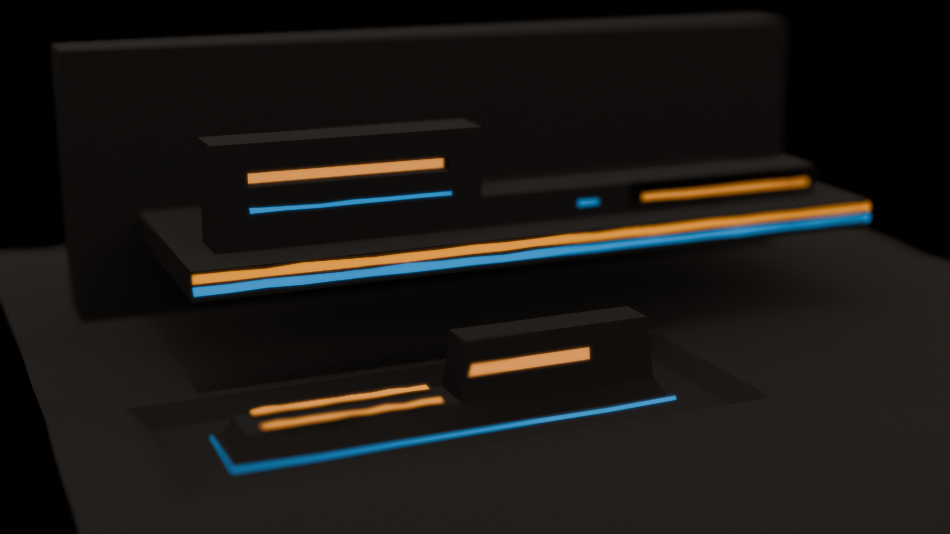
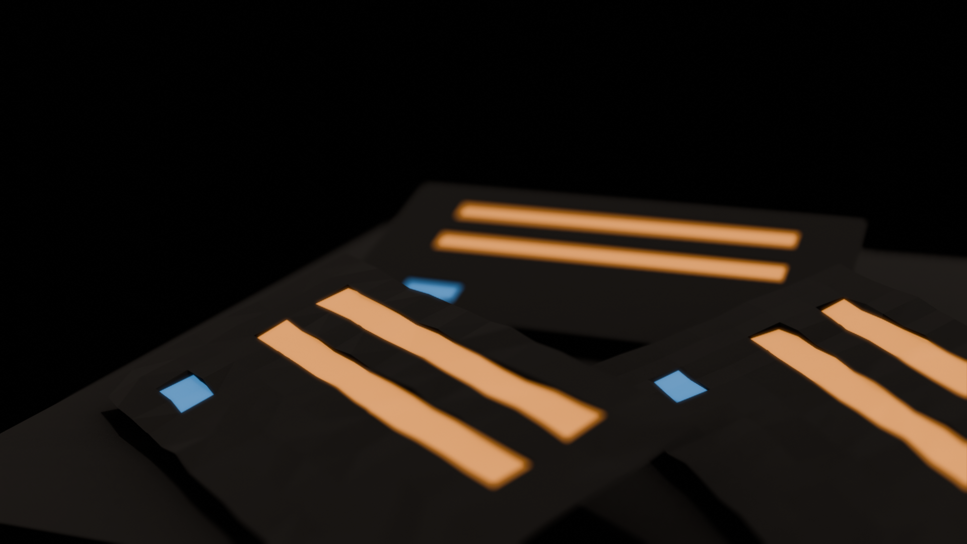
Scenes should incorporate Parcels and Morsels to create a calming, tactile environment with muted lighting and quiet interactions.


Version 1.0
The essence of PaperTech lies in its blend of minimalism and tactile sophistication, combining a modern, digital aesthetic with the tangible feel of premium paper materials. It draws inspiration from the tactile satisfaction of high-end chocolate packaging and the sleek functionality of minimalist interfaces like LCARS. Key aspects include:
In essence, PaperTech is a sophisticated yet calming design language, bridging futuristic digital interactivity with the tactile pleasure of premium paper materials.
PaperTech prioritizes simplicity and functionality, avoiding unnecessary embellishments. All elements adhere to a strict, geometric structure to maintain visual harmony.
The design evokes a paper-like feel, with matte finishes and subtle textures to create a soothing, ASMR-inspired experience.
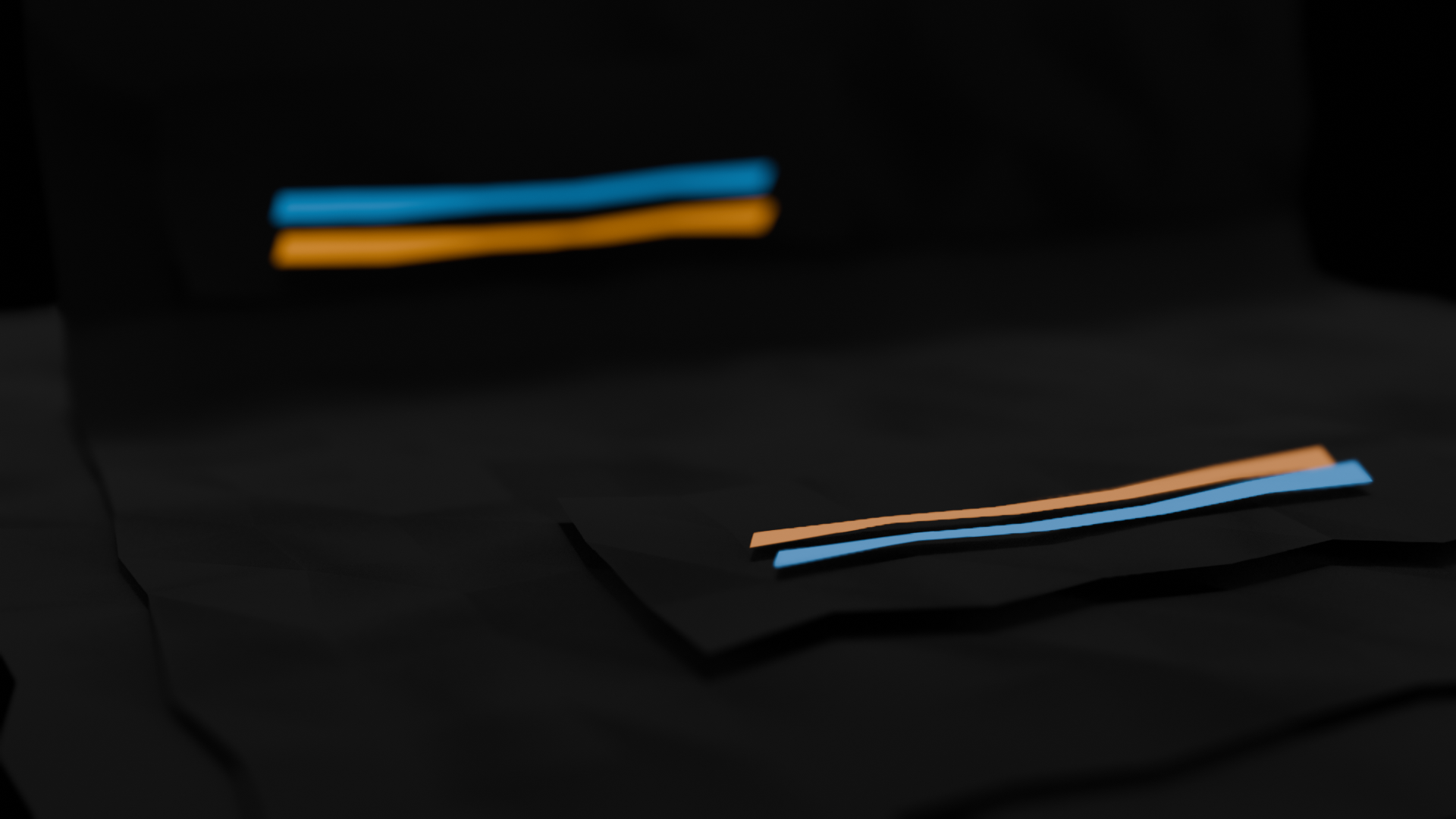
Inspired by minimalist sci-fi aesthetics, PaperTech incorporates subtle, neon-like edge accents in muted colors, giving it a modern, forward-thinking edge.
The PaperTech color palette emphasizes muted grays as base colors, with soft, neon accents for highlighting edges and interactive elements.
PaperTech relies on strict, angular shapes with sharp edges. All elements are constructed from basic geometric forms, like rectangles and polygons, with no rounded corners.
The primary material is a thick, construction-paper-like texture with a matte finish. Surfaces are dry, soft, and non-reflective, resembling high-end chocolate packaging. Subtle folds and creases may be used to enhance the tactile experience.
Ambient lighting in PaperTech is minimal and calm, creating a quiet, ASMR-like experience. Subtle neon-like accents should only appear along sharp edges and should not overwhelm the matte texture.
Indicators in PaperTech are limited to subtle neon accents along edges, signaling interactivity without overt visual noise. Feedback animations, if present, should be minimal and maintain the ASMR-inspired calmness.
Primary containers in the PaperTech design. Parcels are flat, angular structures with matte gray surfaces and subtle neon edges.
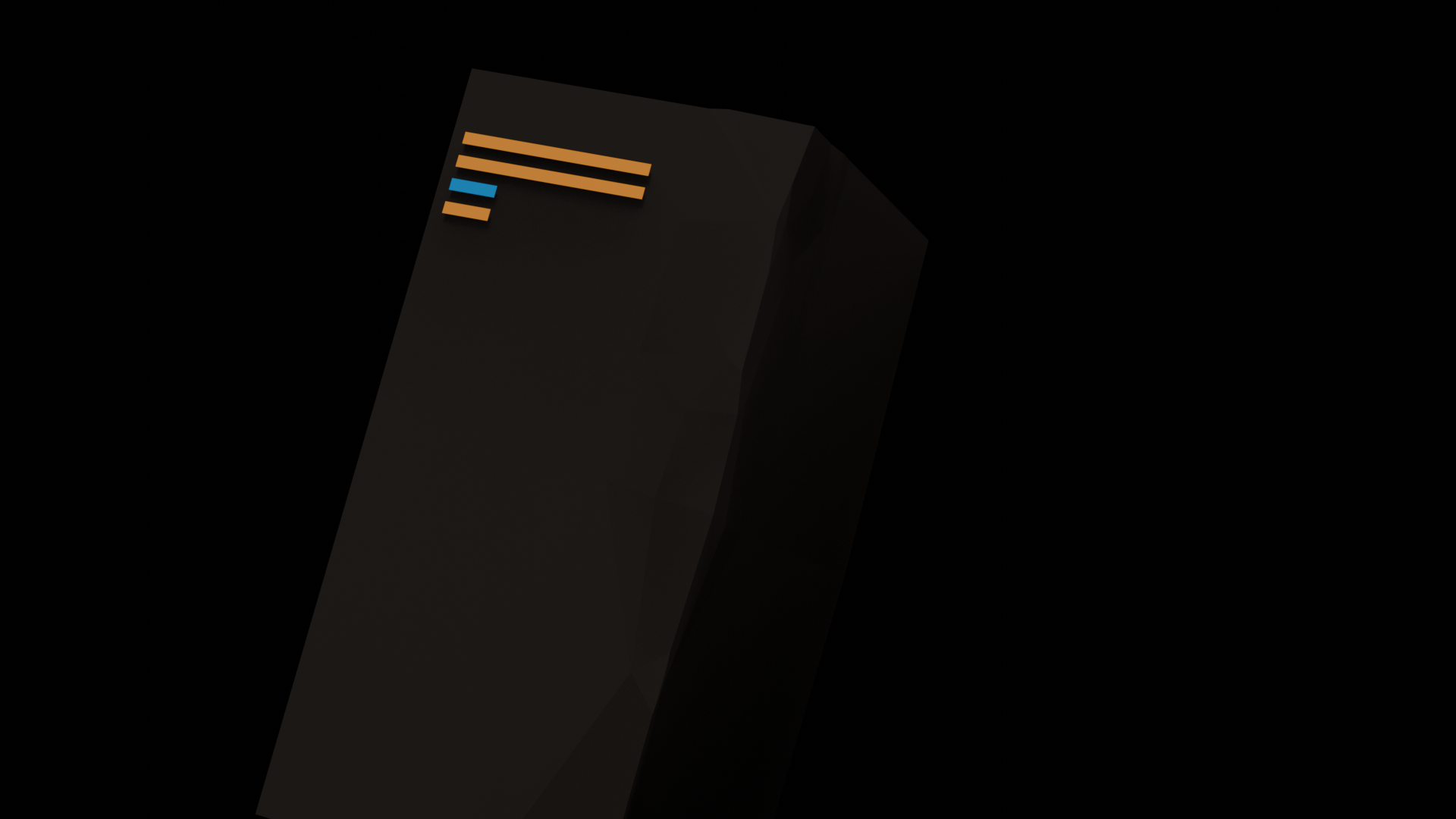
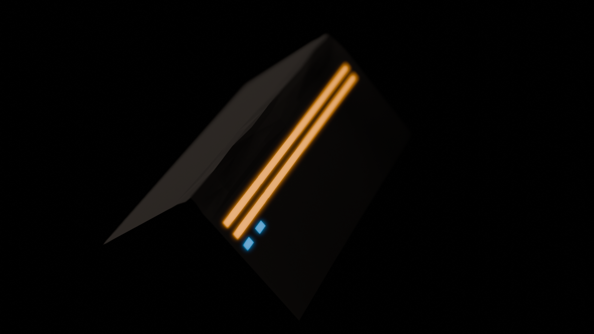
Interactive elements that act as collectibles. Morsels are small, geometric shards that emit a faint glow in muted orange or blue along their edges.
Scenes should incorporate Parcels and Morsels to create a calming, tactile environment with muted lighting and quiet interactions.
